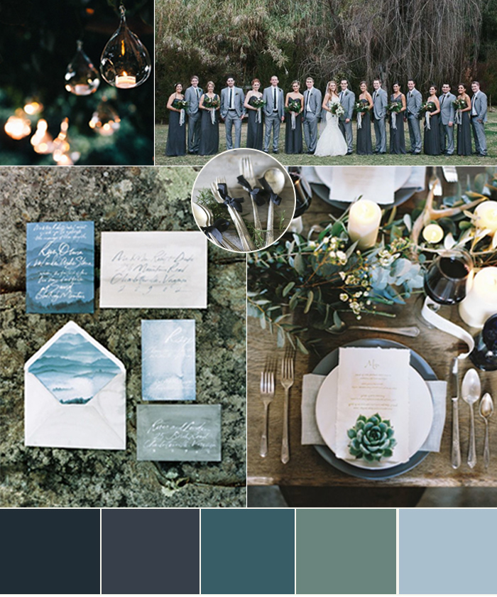
It’s a gloomy, drizzly, and COLD morning here in Boston, so today I’m sharing a board featuring moody blues and greys.
I love the contrast that this board represents: the moody and somewhat masculine color palette is softened by pops of romantic elements like ribbon, candlelight, and pops of vintage detail. Contrast is something we focus on bringing into all of our designs- it’s what gives the design a wow factor and makes the special details stand out.
We can think of so many fun ways to translate this inspiration board into a beautifully designed celebration, but we want to know- what would you create?

Stationery: Julie Song Ink via Grey Likes Weddings | Bridesmaids: Panache Bridal Salon (Amsale) via Green Wedding Shoes Ribbon-wrapped silverware: Revel Blog | Tealight lighting: Samantha Scott Events via Style Me Pretty | Place setting: Alise Taggart via Ruffled
+ show Comments
- Hide Comments
Add a comment